Home Mail Articles Supplements Subscriptions Radio
The following article appeared in Left Business Observer #112, December 2005. It retains its copyright and may not be reprinted or redistributed in any form - print, electronic, facsimile, anything - without the permission of LBO.
2004: income down, poverty up
[For some long-term background, see this article.]
LBO hasn’t looked at the U.S. income and poverty stats in several years, so it’s time for an update. The 2004 numbers are especially striking: three years into an economic recovery/expansion, one frequently (though wrongly) described in the media as “strong,” average incomes are down and poverty is up. That’s not supposed to happen when the economy is allegedly humming.
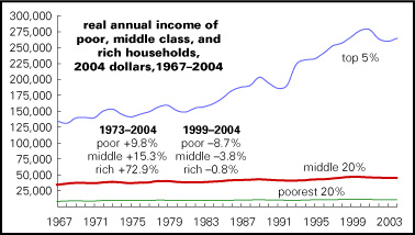
Real income of the median household—the income of the household at the exact middle of the income distribution, adjusted for inflation—fell every year between 1999 (the peak of the 1990s boom) and 2004. As of the latest reading, it was off a total of almost 4%. That’s not as bad as the 5% drop from 1989 to 1993, the period of the first Bush recession and subsequent jobless recovery, but that time it took just two years for income to begin rising after the cyclical bottom. This is the first time since the Census Bureau began publishing figures for household income in 1967 that there have been five negative signs in a row; the previous records were four, clocked in the early 1980s and early 1990s. Figures for family income (which aren’t strictly comparable, because families are generally better off that nonfamily households) go back to 1947, and there’s no hint of anything like five in a row in the first two post-World War II decades.
Taking a longer view, as the nearby chart does, the most salient characteristic of household income over the last 20–25 years is how much better the rich have done than everyone else. The annual Census income survey overlooks the very rich; they’re mostly missed by the questioners, but even if they’re hit, the Census treats all incomes above $999,999 as equal to that “top-coded” amount, allegedly to protect the anonymity of respondents. That doesn’t affect the broad income distribution picture much, but it does understate the action at the very top, where much of the action has been over the last couple of decades. Despite that limitation, we see that since 1973, roughly the year when American incomes started seriously polarizing, the incomes of the top 5% (average income in 2004: $264,387) are up 73%; those for the middle 20% of the distribution (2004 average: $44,455), 15%; and those for the poorest 20% (2004 average: $10,264), just 10%. Those that have have done more than seven times as well as those that don’t.
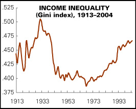
These contrasting material fates are succinctly illustrated by the nearby chart, a history of the Gini index for the U.S. since 1913. The Gini index is one of several stats used to summarize the course of income distribution over time, or to compare it across countries. The Gini is a number between 0 and 1; if a society were perfectly equal, its Gini index would be 0, and if it were perfectly unequal (one person had all the income), it’d be 1. In the real world, the Gini usually falls between .25 (the Swedish neighborhood) and .50 (the Brazilian neighborhood). As the chart shows, the U.S polarized in the early decades of the 20th century, reaching a peak in the late 1920s/early 1930s. The depression and New Deal began a process of equalization, which continued through World War II and into the late 1960s, thanks to unions, tight labor markets, and an expanding welfare state. For a while, it looked like what economists call “depolarization” was a natural feature of a maturing capitalist economy. But that was demonstrated to be false, as the U.S. repolarized, thanks first to the deep recession of the mid-1970s, the subsequent inflation, and then the long wave of social spending cuts, union-busting, factory closures, the explosion of Wall Street wealth and power, and all the other familiar features of the neoliberalism of the 1980s and 1990s. The Gini index for households was .466 in 2004, tying the level of 2001, which was the highest since the early 1940s.
Penury
And as with income, so with poverty. As LBO notes with every income and poverty review, a civilized definition of poverty would produce numbers 50–75% higher than the official rate—12.7%, up from 12.5% in 2005. Cobbled together in the 1960s, when Johnson’s War on Poverty needed something in a hurry, it was based on the mid-1950s fact that the average household spent a third of its income on food. To come up with a minimum income, researchers tripled the Agriculture’s painfully minimal survival food budget (one explicitly intended not to sustain a healthy life). Voilà, a poverty line, one that has simply been adjusted for inflation ever since.
That line keeps falling relative to average incomes. Most poverty researchers set a poverty line at a fixed percentage of average incomes, most often 50%. Such a line matches what people tell pollsters they think a poverty line should be. After all, we do judge our status relative to our peers, not some defunct bureaucrat’s arbitrary judgment. Such a relative definition of poverty would probably produce rates of close to 20%—and for children, it would probably be 24% instead of the official 17.8%.
(For a full history of the poverty line, and the concept’s intellectual history, see Doug Henwood’s After the New Economy, which has what is objectively the best review of poverty and income for nonspecialists around.)
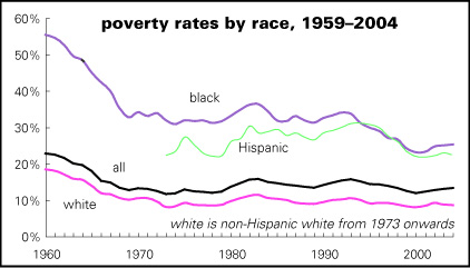
One striking thing about the nearby chart is how little progress there’s been even against this highly forgiving standard. Black and Hispanic poverty rates fell decently in the 1990s boom, but they’ve given back some of those gains since the bust. The overall rate, though, has hardly budged since 1970.
It wouldn’t be surprising to see a stable relative poverty rate, because in some imaginable society income distributions could remain stable around a rising average (though not in this one). But against an indulgent absolute standard, it’s a disgrace the U.S. economy can’t do better.
Global view
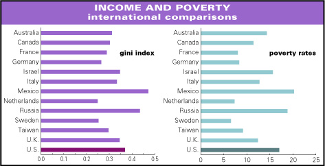
It’s also a disgrace how the U.S. stacks up in the international league tables. The last set of charts comes from the Luxembourg Income Study, an international consortium of income and poverty researchers, which has assembled a splendid database of comparable statistics. Among the thirteen major countries shown, the U.S. has the third most unequal distribution of income, behind Mexico and Russia, and the third-highest poverty rate, behind those same countries. The richer countries can be thought of as falling into three groups:
• The predominantly English-speaking (Australia, Canada, UK, U.S.), which are the most unequal and also have the highest poverty rates (average Gini: 0.322; average poverty rate: 13.8%); Israel’s numbers are similar. These generally have the most minimal welfare states and least regulated economies.
• The continental European countries (France, Germany, Italy, Netherlands), with lower poverty rates and less income inequality (Gini: 0.283; poverty: 9.1%). They’re generally more generous and less liberalized than what the French like to call the Anglo-Saxons. Taiwan’s numbers would put it in this class, were it in Europe.
• Scandinavian countries (Sweden, along with two countries not shown in the graph, Finland and Norway), with low poverty rates (average: 6.1%) and the most egalitarian income distribution anywhere (gini: 0.272). They have exceedingly generous welfare states—and quite high-tech economies nonetheless.
It’s a virtual certainty that almost no Americans know these things about their country. If asked, most orthodox types would point to the great mobility of American society to refute critiques of inequality and mass poverty, but in fact American society isn’t unusually mobile by international standards. For a moment, it seemed like the wreck of New Orleans might make polarization and poverty into real political issues, but that moment seems to have passed. Because, as Randy Newman put it in his song addressed to Karl Marx ("The World Isn't Fair"):
I’m glad I’m living in the land of the free
where the rich just get richer
and the poor you don’t ever have to see.
It would depress us, Karl….
Home Mail Articles Stats/current Supplements Subscriptions Radio