Home Mail Articles Stats/current Supplements Subscriptions Links
an LBO overview
last update: May 9, 2000
The charts are based on public domain data massaged by LBO. Please do not reproduce or disseminate without permission.
Census Bureau figures released in October 1997 show that the average (median) U.S. household had still not regained the income lost in the 1989-93 slump. Longer term, average 1996 incomes were virtually the same as 1973's, meaning 23 years of stagnation. So, despite the recent bout of good news on wages and employment reported elsewhere in this issue, there's a lot of catching up to do. For a country built on myths, and partial realities, of upward mobility, this is a strange state of affairs.
There have been several long waves of polarization and depolarization throughout U.S. history. Early America, from colonial days through the first years of the 19th century, was notable for having a far more egalitarian distribution of income than Europe (if, that is, you overlook the slaves).* That was not to last. Right-wingers who love to quote Alexis de Tocqueville on the wonders of the American way of life rarely include this observation by the French visitor: "I am of the opinion...that the manufacturing aristocracy which is growing up under our eyes is one of the harshest that ever existed.... The friends of democracy should keep their eyes anxiously fixed in this direction; for if a permanent inequality of conditions and aristocracy...penetrates into [America], it may be predicted that this is the gate by which they will enter."
*Of course you can't overlook the slaves. A number of readers objected to the original wording in LBO #80 that "Early America, from the colonial days through the first years of the 19th century, was notable for having a far more egalitarian distribution of income than Europe (if, that is, you overlook the slaves.)" The parentheses were intended to emphasize the exception, not marginalize it, and the tone was intended to be ironic; apparently neither intention hit its mark.Adding the slaves to the calculation of wealth distribution would not bring early America up to the level of European inequality, nor would it change the fact that inequality rose sharply as the 19th century progressed. But, that point aside, no account of life in the U.S. could overlook either the slaves or their descendants. Americans of African descent have profoundly influenced the political economy, culture, and physical landscape of this country in every imaginable way. To take an example relevant to this context, as David Roediger shows in his admirable book, The Wages of Whiteness, slavery greatly inhibited the development of class consciousness of white workers, who were all too easily persuaded that wage labor represented a kind of freedom in contrast with slavery. This delusion of independence and superiority persists today, over 130 years after the end of slavery, in highly racialized notions of welfare dependency and the "underclass," disparaging caricatures that help sustain white workers' identification with their bosses' politics and perpetuate countless abuses of black Americans. We have so racialized class that class is often barely visible - which is not, by any means, an attempt to subordinate race to class, since you can hardly talk about one without talking about the other.
Sorry.
And enter they did. There was a steady increase in inequality -- both in income and wealth -- from the 1820s through the Civil War, bringing the U.S. up to European levels of lopsidedness. Though inequality probably dipped a bit during the war, it stayed high until the outbreak of World War I. (Wars usually lessen the degree of inequality; they require the mobilization of unskilled workers to make armaments, pushing up low-end wages, and wartime inflations can ravage old fortunes.) Inequality quickly returned to prewar levels during the 1920s.
The crash, depression, and war changed that. Fortunes were destroyed, and in the postwar boom, incomes at the bottom and middle of U.S. society rose strongly, bringing about a significant compression in the distribution of material goods and money. Of course, even at its most egalitarian moment, the U.S. remained a polarized society, but it was still widely thought that something had changed to make the new arrangements permanent. In 1955, Simon Kuznets published his famous "inverted U" theory of capitalist evolution: that income inequality rises in the early stages of development, and falls as economies mature. Economists came to believe this as a fact of their "science," and you still hear it from development specialists at the World Bank and in academia to excuse the vast increase in inequality in the Third World over the last 15 years. Recent U.S. experience suggests that Kuznets' U may have another tail to tell.
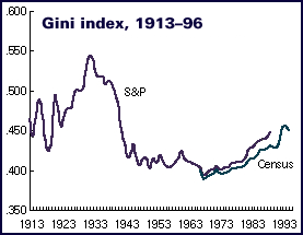
U.S. income inequality has been on an uptrend since the late 1960s. The point is made most clearly by the nearby graph of the Gini index, a statistical measure of (in)equality. The index is meaningless on its face; it makes sense only as a way of comparing distribution over time, or comparing distribution in two societies at a given time. It ranges from 0 (perfect equality) to 1 (perfect inequality -- one person has all of a society's income). The graph here is cobbled together from two sources, and its first half should be taken with a grain of salt. (For a fuller explanation of the Gini index, click here. For and an explanation of the sources of this long-term chart, click here.) But it does show the polarizing trends of the late 1910s and 1920s, the leveling trends of the 1930s through the 1960s, and the polarization ever since. Income inequality in 1996 is just a hair below 1994's post-World War II record, and the long-term situation is at its most polarized in 60 years.

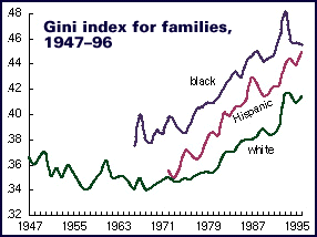
According to conventional racial categories, "minorities" show more unequal distribution of income than do whites.
For some reason, the 1990s do not share the 1980s' bad reputation for stagnation in average incomes and polarization between the extremes, but it should. The median real income of U.S. households fell 7.3% between 1989 and 1993; a bit over half that loss has been regained, but 1996's figure was still 3.0% below 1989's. (The median is the spot at the middle of a distribution, with half the population coming in above that level, and half below. It's a better measure of distribution than the arithmetic average or mean, since very high incomes would pull misleadingly pull such an average up. Medians, however, are unmoved by good times at the upper extremes.) Recent performance is far worse than that of the 1980s -- though it's likely that things will look a bit better when 1997 figures are reported next October.
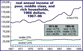
The chart below offers a fuller picture of what's been going on behind these averages: stagnation, with a slight downward bias, for poor and middle-income households, and strong growth at the high end. Put another way, almost all the benefits of economic growth, at least by official measures of inflation-adjusted income, have gone to the richest 5% of U.S. households. The next 15% have done well, if not spectacularly, while the bottom 80% has been lucky to stay in place. (Another way of thinking of this is that about 95% of the benefits of economic growth over the last 25 years have gone to the richest 5%.) Because of this, more people are working longer hours than at any time in modern history, which, while it helps keep up incomes, is hell on both home life and the public culture. People who work 50 hours a week or more have little spare energy for anything more challenging than a TV.
There's yet another story to tell if you break things down by sex and race. As the chart below shows, black households have been doing a bit of catch-up with whites. This is the combined result of broad income gains for black households -- at all income levels, even the poorest -- and stagnant-to-declining incomes for the bottom 80% of the white population. 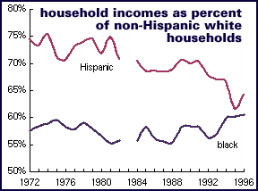 The gap remains huge, with average black incomes just 63% of white, but there's no denying progress over the past decade. (It remains to be seen whether this progress will survive the attack on affirmative action.) This has brought the black poverty rate (see chart nearby) to an all-time low. For "Hispanic" households -- a Census Bureau name and classification that many people object to -- the news is a lot less good, with a one-year bounce in 1996 coming after more than 20 straight years of relative decline, and with only a minor reversal of the rising poverty trend.
News on the gender gap is even more dramatic (see chart below). Average incomes for all women were 54% of men's in 1996, a vast canyon for sure, but a lot better than 1980's 39%.
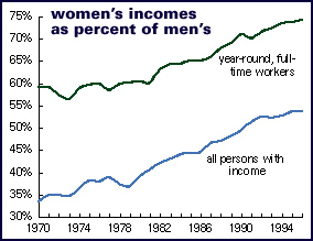
Part of the reason for this gap is that fewer women work (for pay, that is) than men, and of those who do work, fewer work year-round full-time. For women who work outside the home, their incomes were 62% of men's in 1996, up from 47% in 1980 and 38% in 1970; for those who work a full schedule, their incomes were 74% of men's, up from the 60% average that prevailed through most of the 1970s.
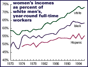
As with the black-white gap, this income narrowing is the joint product of eroding male incomes and rising female ones; men's real incomes in 1996 were 5% below 1989 levels, while women's were 5% above. It must be said that these gaps are still too wide, that women are paid significantly less than men with similar qualifications, and that employed women still do a lot more housework and childcare than their male companions. But progress, at least in material terms, has been made.
Though we've been having relatively good economic times for the last couple of years, that story doesn't jump out from the chart of the official poverty rate. Most striking, though, is the line marked "black"; the poverty rate for African-Americans in 1996 was the lowest on record - though still well over a quarter of the black population.
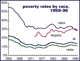
The poverty rate is the percentage of persons falling below a certain income level, depending on household size. For a single person in 1996, it was $7,995 for a single person, $10,233 for two, and $16,036 for four. These lines were set in the early 1960s, and have simply been adjusted for inflation ever since - in other words, today's poor are conceptually supposed to be at the same standard of living as the poor of 35 years ago, despite the general growth in income. (Click here for more detail.) A more honest count of the poor - one either based on an updated market basket (rather than the 1955 or 1960 one today's line is based on) or figured on a poverty line measured against average incomes rather than a fixed standard from long ago (like, say, setting the poverty line at half the average income, which would push the line up to $19,250 for two people or $26,852 for four, 90% and 67% higher than official levels) - would yield a poverty rate almost twice the present level, in the 20-25% range.
Despite the shortcomings of official measures they can give a good relative picture of the poverty risk of various population groups. Here are some sample poverty rates for some interesting groups (and remember that a "real" poverty rate would probably be 1.5 to two times as high). Rates shown are mostly for households, which include singles and unrelated roommates (some of whom may regard themselves as related, even though the law doesn't agree); households are generally poorer than families.
|
|
|
| households | |
| all | 13.7 |
| men | 12.0 |
| women | 15.4 |
| under 18 | 20.5 |
| over-65 | 10.8 |
| white | 11.2 |
| black | 28.4 |
| under-18 | 39.9 |
| "Hispanic" | 29.4 |
| central cities | 19.6 |
| suburban | 9.4 |
| rural | 15.9 |
| families | |
| all | 11.0 |
married-couple |
5.6 |
| white | 5.1 |
| black | 9.1 |
|
|
|
It's unfortunate that such material progress for women and African-Americans has come amidst a general stagnation of incomes, and a sharp and steady erosion of white men's paychecks -- and it shouldn't be forgotten that there's still lots of polarization within sexual and racial categories, as well as between them. But sex and race privilege is a pretty hard thing to defend, even if some of the white men hit hardest by this trend are those in the lower half of the pay scale, Tim McVeigh's class brothers. But anyone who uses these figures to promote a Limbaughesque agenda of white guy ressentiment will find himself under an LBO fatwa.
Sources U.S. Census Bureau, historical income and poverty data; Eugene Smolensky and Robert Plotnick, "Inequality and Poverty in the United States: 1900 to 1990," University of California, Berkeley, Graduate School of Public Policy, Working Paper #193 (July 8, 1992). The long-term Gini chart uses Smolensky and Plotnick's numbers for the early years until Census figures began in 1947.
Technical note A word on where these number come from. The Census Bureau (in partnership with the Bureau of Labor Statistics) does a monthly survey of about 50,000 households, called the Current Population Survey, that is the source of the employment and unemployment figures. The March survey includes an expanded set of income and other demographic questions, which form the basis of the annual income and poverty statistics. The CPS produces much wonderful data, but it does have several shortcomings. It mostly misses rich people, who understate their income anyway (as do poor people, but they account for a lot less of society's money), and then uses a statistical technique that marks down the incomes of the very richest. Specifically, all incomes over a certain amount, recently around $300,000, are treated as that amount, a procedure called top-coding. This is supposed to protect the privacy of the respondents, since the CPS records are public data. It doesn't matter that much for studying the bottom 95% of the population, but it does matter for studying the rich. The Fed's Survey of Consumer Finances offer the best look at wealth and the wealthy.
Home Mail Articles Stats/current Supplements Subscriptions Links