 rthodox measures, since it emerges from sources whose only beef with current orthodoxy is that it's not capitalist enough.
Home Mail Articles Stats/current Supplements Subscriptions Radio
Laissez-faire Olympics
an LBO special report
March 26, 2005
Every year since 1995, the Heritage Foundation and the Wall Street Journal put out an Index of Economic Freedom, ranking countries on their fealty to the precepts of free markets and free trade. Freedom being the unexamined rage since George Bush's second inaugural address (which used the word twenty-seven times), LBO decided to see whether the index had any economic meaning. Sorry to spoil the surprise, but it really doesn't.
The Freedom Index rates countries on a 1-5 scale on 50 factors, covering areas like trade policy, tax rates, regulation, inflation rates, and property rights. The report's authors are surprisingly reticent on that matter, allowing the reader to conclude that the virtues of "freedom" (meaning freedom to do business, not freedom from want, of course) are self-evident. They do devote half a page to arguing that countries that improved their Freedom Score show better rates of economic growth, and a page to showing how richer countries have higher freedom scores.
But as anyone who lasted a week in a basic statistics course knows, proving a correlation doesn't prove causation; it could be that increasing wealth causes the index to rise, and not vice versa. Strong growth attracts foreign investment, which would automatically raise a country's freedom score. Economic expansion can also raise the value of a country's currency, and weakness can have the opposite effect; those could also affect international growth comparisons. (If a country's currency strengthens, this flatters its numbers when translated into the lingua franca of almost all international comparisons, the U.S. dollar; if it weakens, the country's performance looks worse. But since currency markets frequently gyrate far out of proportion to developments in the real world, using market prices could be very misleading.) Corruption lowers a country's score, but when times are good, outstretched palms are often hard to notice. Lowering taxes, which raises the freedom score, and can stimulate growth in the short-term, but such stimuli are usually temporary. Government expenditures on things like unemployment insurance can rise in bad times, lowering the freedom score (and vice versa). And - not to impugn the integrity of a gaggle of right-wing ideologues, of course - there's always the chance that knowledge of a country's economic performance might affect the judge's grades.
A better test
A more interesting test than Heritage's would be to see how countries' scores in a base year correlated with subsequent growth. Investments are planned and career choices made on the basis of expectations for the future, and expectations are formed mainly by conditions in the present and recent past. And it's rare that political, economic, and social structures change radically over a few years. So assuming the index means anything at all, it should have some bearing on future performance.
Let's see how scores in 1996 correlate with economic growth in the following years. And we'll take a closer look at a version the Heritage/WSJ measure, the change in freedom and its correlation with growth.
(The original 1995 index covered just 101 countries, leaving out some important ones like the Netherlands and New Zealand. In 1996, coverage rose to 139 countries, close to today's 155. So it's best to use 1996 as our starting point.)
Instead of using GDP expressed in U.S. dollars, as is sometimes done, it's better to strip out pure currency market changes by using so-called purchasing-power parity (PPP) values, which attempt to express incomes at exchange rates that correspond to actual buying power. (Heritage may well have used PPP incomes - it's what they use in this chart - but they don't specify what measure they use in the text of the report.) It's not a perfect measure - there's a lot of estimation and imputation involved - but it's become a standard for international economic comparisons.
And instead of using aggregate GDP, as the report does, it's more revealing to use per capita figures; if a country's economy is expanding as rapidly as its population, the population isn't materially better off. Of course, GDP per capita is also a highly imperfect measure; it simply divides the monetary value of a country's economic production by its population. It says nothing about how income and wealth are distributed, much less the actual distribution of material welfare. But it too is the orthodox metric of comparison, and not useless as a guide to relative welfare across time and space. It makes good sense to test the economic freedom index against orthodox measures, since it emerges from sources whose only beef with current orthodoxy is that it's not capitalist enough.
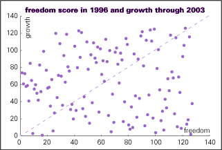
In the exercises that follow, the 125 countries with scores for both 1996 and 2003 were ranked by their freedom scores and their growth rates, and their positions in the two sets of rankings compared. (The test ends in 2003 becuase 2004 GDP data aren't available yet.) The first chart, nearby, compares countries' freedom ranks in 1996 with their ranks in 1996-2003 growth contest. (It'd be impossible to label this chart, so countries are represented by nameless dots.) The dots are all over the place. If freedom and growth really went together, the dots would hug the dashed line. (For example, if a country ranked 45th on freedom also ranked 45th on growth, its dot would fall on the dashed line.) For the statistically inclined, the correlation is -.02, which means that the association is actually in the opposite direction - more "freedom" means less growth - but the correlation is meaninglessly small.
Running the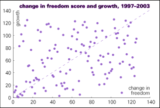 numbers on the report's measure, the improvement in the index vs. GDP expressed in 1995 U.S. dollars, produces somewhat better correlations (.33, to be precise). But that's still very far from impressive; the improvement in the index can explain statistically less than 10% of GDP growth - ignoring the fact that growth itself probably explains some of the improvement in the index. An analysis of the second chart by the naked eye would conclude the relationship is as good as random.
The Heritage/WSJ index doesn't even correlate with bad things. Similar ranking exercises performed with carbon dioxide emissions per dollar of GDP (a measure of ecological waste or efficiency) and the gini index (a measure of inequality) produce more tiny negative numbers: correlation coefficients of -.04 and -.06 respectively, also meaninglessly small.
Gee, isn't it striking how often the word "meaningless" appears in this piece. It's so much fun being on the right - you're liberated from the tyranny of having to make sense.
© Copyright 2005 Left Business Observer. All rights reserved.
Home Mail Articles Stats/current Supplements Subscriptions Radio