Home Mail Articles Stats/current Supplements Subscriptions Links
an LBO overview
last update: November 9, 2001
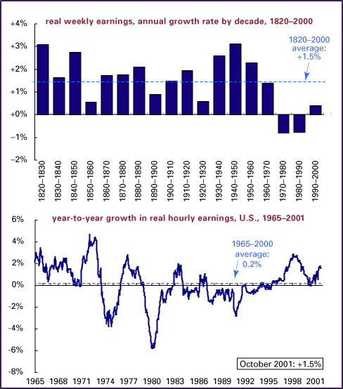
These charts offer two views - the first, average growth rates in weekly earnings by decade since 1820; the second, year to year changes in hourly wages since 1890. (Figures for manufacturing only through 1964; all private sector workers since.)
With the advance of capitalism in the 19th century, more people worked longer hours for pay. The lengthening workweek pushed up weekly earnings - though remember, the share of the population working for pay has increased fairly steadily over the last 175 years. That means, among other things, that the population represented by the early numbers was much less representative of the average economic person than today's numbers are - especially since (disproportionally male) manufacturing workers are taken to represent the whole universe through 1964.
Please note that the top chart shows weekly wages, and the bottom shows hourly wages. Average weekly wages reflect not only changes in the hourly wage, but also the length of the workweek and the makeup of the workforce (the mix of part- and full-time, for example). Weekly wages are shown in the first chart because the data begins in 1820, about 70 years earlier than the hourly data begins.
Adjust your browser window's size on the chart below.
Note that the decline in real earnings - which ran with little interruption from 1973 through 1995 - was unprecedented in U.S. history. Since 1995, real hourly earnings have been rising in the U.S. - even with the recent slowdown. This has pushed the decade's average into positive territory, undoing the sluggishness of the early 1990s. We'll see if this upturn is sustained; if, as New School economist Anwar Shaikh has argued, we're in the early phases of a long-wave upcycle (meaning the end of the 1970s-1980s crisis, which gave us the only negative real wage decades on this chart), then it may be. With unemployment on the rise, we should expect slower earnings growth (loose labor markets weaken workers' bargaining power). The question of the long-term trend probably won't be resolved until the recession ends; if the recovery is strong, the long boom argument holds; if it's not, we could be in for rough economic weather.
It's possible also that the real wage upturn is an artifact of adjustments made to the consumer price index by the Bureau of Labor Statistics to accommodate those who've argued that the index overstated inflation. If the index wasn't overstating inflation, then probably the actual real wage gain is from 0.7-1.0 percentage points lower than the chart shows - though still positive.
If there are real real wage gains, then it's about damn time.
We're constantly told by economists and pundits that the key to
getting wages up again is raising productivity. 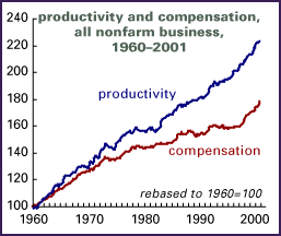 But
over the last several decades, productivity - the inflation-adjusted
value of output per hour of work - has risen much faster than
real compensation (wages plus fringe benefits adjusted for inflation).
Note the "wedge" between the two lines on the chart
nearby. From that wedge are fatter profits and higher stock prices
made. The much-touted acceleration in productivity growth since
1995 has probably contributed to the rise in real wages since
then, but the gap remains very wide.
But
over the last several decades, productivity - the inflation-adjusted
value of output per hour of work - has risen much faster than
real compensation (wages plus fringe benefits adjusted for inflation).
Note the "wedge" between the two lines on the chart
nearby. From that wedge are fatter profits and higher stock prices
made. The much-touted acceleration in productivity growth since
1995 has probably contributed to the rise in real wages since
then, but the gap remains very wide.
Productivity can be thought of as setting a limit to wage increases. Sustained increases in wages in excess of productivity growth would result in - egads! - a profit squeeze, and an eventual employers' offensive against this intolerable situation. But if workers are weak and unorganized, there's no reason that wages can't lag productivity growth for a long, long time - a fact of which this chart is living proof.
Here's another way to think about the growing gap between productivity and wages. According to the World Bank, in 1966, U.S. manufacturing wages were equal to 46% of the value added in production (value-added is the difference between selling price and the costs of raw material and other inputs). In 1990, that figure had fallen to 36%.
Sources: Historical Statistics of the United States, Colonial Times to 1970; National Bureau of Economic Research; U.S. Bureau of Labor Statistics. Real wage is the nominal wage divided by the consumer price index.
© Copyright 2001, Left Business Observer. All rights reserved.
Home Mail Articles Stats/current Supplements Subscriptions Links