Home Mail
Articles
Stats/current
Supplements
Subscriptions
Links
The following article appeared in Left
Business Observer #78, July 1997. It retains its copyright and
may not be reprinted or redistributed in any form - print, electronic,
facsimile, anything - without the permission of LBO.
Measuring privilege
So it looks like wealth didn't get that much more concentrated
in the 1980s after all; we had to wait until the 1990s for that
to happen.
One of the wonders of modern social science is the Survey of Consumer Finances (SCF), conducted
by the Federal Reserve in cooperation with the IRS. While the
U.S. Census Bureau collects and publishes plenty of information
on income, and even some on wealth, its money questions are usually
a smallish part of a broader population survey, and they also
miss lots of action at the upper end. The SCF, though, is based
on 90-minute interviews, and the surveyors pay special attention
to the rich. It's probably the best picture of household finances
done anywhere in the world.
The survey has been taken every three years since 1983, though
1986's was fairly rudimentary. Results from the 1983 edition were
reported in rich detail in the Federal Reserve Bulletin,
the central bank's flagship periodical. Of three articles on the
SCF, one was devoted to the very richest. Since 1989, though,
only an overview article has been published in the Bulletin,
and data on distribution made available only in highly technical
unpublished working papers.
Those technical papers are essential; assembling the raw data
of the survey into a representation of 100 million households
is intensely complex - especially if you're seriously interested
in a reliable portrait of rich people. But it's not very user-friendly
to present the wealth distribution numbers only as an appendix
to a complex paper explaining how they were arrived at. As a public
service, LBO presents the crucial figures at the below.
Who owns, who owes (percent
of totals), 1995
|
bottom 90% |
top 10% |
top 10%, percentile
breakdown |
| 9098.9 |
9999.4 |
99.5100 |
| assets |
37.9% |
62.1 |
31 |
6.9 |
24.2 |
| principal residence |
66.4 |
33.6 |
25.7 |
2.7 |
5.2 |
| other real estate |
20.2 |
79.7 |
43.9 |
8.8 |
27.1 |
| stocks |
15.6 |
84.4 |
42.2 |
10.7 |
31.5 |
| bonds |
9.7 |
90.2 |
34.5 |
9.2 |
46.5 |
| trusts |
13.1 |
86.8 |
42.6 |
10.4 |
33.8 |
| life insurance |
55.0 |
45.0 |
27.8 |
6.1 |
11.0 |
| checking accounts |
57.7 |
42.3 |
26 |
4.6 |
11.6 |
| thrift accounts |
43.1 |
56.9 |
40.9 |
8.2 |
7.8 |
| other accounts |
37.9 |
62.1 |
35.2 |
7.0 |
19.8 |
| business |
7.7 |
92.2 |
20.8 |
11.5 |
59.9 |
| autos |
77.6 |
22.4 |
17.8 |
1.9 |
2.6 |
| other |
29.3 |
70.6 |
39.2 |
4.8 |
26.6 |
| |
| liabilities |
70.9 |
29.1 |
19.3 |
3.0 |
6.7 |
| principal residence (mortgage) |
78.4 |
21.6 |
17.2 |
1.8 |
2.6 |
| other real estate |
25.2 |
74.7 |
41 |
10.2 |
23.5 |
| other liabilities |
80.6 |
19.4 |
9.6 |
1.5 |
8.3 |
| |
|
|
|
|
|
| net worth |
31.5 |
68.4 |
33.2 |
7.6 |
27.5 |
| nonresidential |
22.5 |
77.5 |
34.2 |
9.1 |
34.2 |
| |
|
|
|
|
|
| income |
68.9 |
31.1 |
19.6 |
3.4 |
8.1 |
| |
| dollar values |
| income |
$33,273 |
134,933 |
94,690 |
293,565 |
700,677 |
| average net worth |
39,252 |
1,217,375 |
596,974 |
2,844,934 |
10,757,046 |
These distributions are based on sorting households
by their total net worth. Columns show share of each category
held byeach net worth grouping. The first two columns are the
bottom 90% and the top 10%; the next three break down the top
10%, with (reading from right to left) the richest 1/2% in the
last column, the next 1/2% in the fourth column, and the next
9% in the third. The last two rows show the dollar values for
income and net worth. For example, the richest 10% of the population
has 68.4% of net worth and 31.1% of income; their average income
was $134,933, and their net worth, $1,217,375. Rows are mostly
self-explanatory; nonresidential net worth excludes the equity
in the principal residence (that is, its value less the mortgage
on it). Source: Arthur B. Kennickell and R. Louise Woodburn,
"Consistent Weight Design for the 1989, 1992, and 1995
SCFs, and the Distribution of Wealth," unpublished Federal
Reserve technical paper, June 23, 1997. (Click here
for the paper, and here
for its appendix; these are big files, especially the appendix
- 310k and 4,700k respectively.)
Wealth is concentrated far more densely
than income. The richest 0.5% of the population claimed 8% of
income in 1995 - but 28% of net worth, almost as much as the bottom
90% of the population (32%). (Other, earlier studies show that
the wealth of the bottom 90% is almost entirely accounted for
by its upper third; the bottom 40% of the population has just
1% of total wealth.) If you strip out the principal residence,
the major repository of middle-class wealth (but one not easily
redeployable in the capital markets: most people won't sell the
house to buy stocks), the top 0.5% pulls well ahead of the bottom
90%. The richest 10% of the population - about 10 million households
- owned 84% of the stock and 90% of the bonds held by individuals
(including that held indirectly through mutual funds). The democratization
of ownership supposedly brought about by mutual funds has a long
way to go.
One important disclosure in the technical part of the paper
- written by Arthur Kennickell, of the Fed, and Louise Woodburn,
formerly of the IRS and now with Ernst and Young - is that revisions
to the 1989 survey now show no substantial increase in the concentration
of wealth in the 1980s (see graph nearby).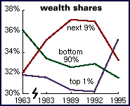 But
the 1990s have brought concentration to record levels, with the
share of the top 1% rising by nearly five percentage points. That
gain came mostly at the expense of the next 9%; the share of the
bottom 90% continued a long erosion. It should be said, though,
that while the 1989, 1992, and 1995 surveys are very similar,
the earlier ones are different enough that comparisons should
be made skeptically.
But
the 1990s have brought concentration to record levels, with the
share of the top 1% rising by nearly five percentage points. That
gain came mostly at the expense of the next 9%; the share of the
bottom 90% continued a long erosion. It should be said, though,
that while the 1989, 1992, and 1995 surveys are very similar,
the earlier ones are different enough that comparisons should
be made skeptically.
In real dollar terms, while income and net worth fell for virtually
every group between 1989 and 1992, between 1992 and 1995 the rich
flourished. Incomes of the bottom 90% rose 0.9% after inflation
(total, not per year) - but those of the top 0.5% were up 44%.
Nonresidential net worth was up 1.5% for the bottom 90% - but
26% for the very richest. Still, for all income classes, household
income had not yet regained 1989's peak by 1995.
There's one area in which the bottom 90% outdid the top 0.5%:
debt. Liabilities for the bottom 90% rose 11%, while falling 19%
for the richest. Assets were a virtual mirror image, with the
masses' assets barely rising (+2%) while those of the richest
rose ten times as much (22%). This complementarity is no surprise,
since consumer and mortgage credit boil down to the very rich
lending to the middle class and the poor.
Cite statistics like these and apologists will immediately
respond that they don't include private pension accounts. This
is true enough, and including them would lessen the distributional
skew a bit, but there are good reasons for excluding them. Even
in orthodox economics, pensions are seen as deferred wages - a
smaller paycheck today in exchange for an income in retirement.
Nonpension wealth, though, usually provides an income today, and
can be sold and transformed into anything a rentier desires -
a vacation house, a German government bond, a short position in
the Thai baht, or even a real business. You can't do that with
your IRA.
Home Mail
Articles
Stats/current
Supplements
Subscriptions
Links