Home Mail Articles Stats/current Supplements Subscriptions Links
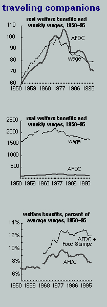
A number of readers found the chart on the front page of LBO #71 incomprehensible.
Here's a gloss.
Contrary to propaganda, the interests of workers and welfare recipients are not really in conflict; welfare is a kind of floor under the wage. The chart in the last issue plotted the real value of the hourly wage and the real welfare grant, both indexed so that 1973=100. While that kind of graph is good at showing the the two lines have followed a common trajectory, it offers no appreciation of the chasm between them in money terms.
The first chart a replica of last issue's. Its wage line conceals a statistical trick. The Bureau of Labor Statistics (BLS) didn't begin reporting an average wage for all private sector workers until 1964 - but manufacturing data is available from 1914. The wage index line is a composite, using the yearly inflation-adjusted change in the manufacturing wage from 19501964, and in the average for all private workers ever since.
Comparing incomes won't allow such a splicing. So the next two charts show a break at the transition - the manufacturing wage to the left of the break, the broader measure to the right. The middle chart shows the average monthly wage, in 1995 dollars (4.3 times the weekly wage); the line way below it is the average grant under Aid to Families with Dependent Children (AFDC), the single-mother support system that people love to hate. In 1977, its real value peaked at $201 (in 1995 dollars); last year, it averaged $135, a decline of 33%. The weekly wage (again in 1995 dollars) peaked in 1973, at $499; last year, it was $394, a decline of 21%.
The crash in AFDC has been mitigated by Food Stamps (a program that agribusiness loves, which helps account for its stability). The third chart shows the average AFDC grant and that plus the average Food Stamp benefit, both expressed as a percentage of the average wage.
When AFDC began in 1936, the benefit was 8.3% of the average wage; it's now 7.9% and likely to drop sharply from here. The real wage is at early 1960s levels (the wage line in the first chart exaggerates this a bit), and the welfare grant is the stingiest it's been (measured as a percentage of the wage) since 1965. Joan Robinson said that the rising real wage of the 1950s and 1960s proved Marx wrong about immiseration under capitalism; the increasing generosity of the welfare state underscored Robinson's point. But now that boom has almost entirely been reversed, an amazing feat under a putative democracy. Maybe Robinson's judgment was a bit rushed.
Note added October 1996
This was written months before Clinton signed the evil welfare bill. In the light of the evidence assembled above, it looks like wages have only one way to go from here - down.
© Copyright 1996, Left Business Observer. All rights reserved.
Home Mail Articles Stats/current Supplements Subscriptions Links