Home Mail Articles Stats/current Supplements Subscriptions Links
There are several ways to express the degree of income inequality
in a society. The simplest way is to arrange whatever units you
choose persons, families, or households in rank order, from poorest
to richest; divide the hierarchy into fifths (quintiles) or tenths
(deciles); and compute either the average income by decile or
quintile or the share that each grouping has of the society's
total income. Then, the shares or averages of rich and poor can
be compared.
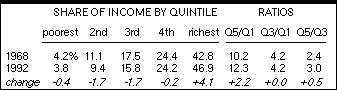
Here are examples for the U.S. for two important years 1968, when
the U.S. income distribution was the most equal it has been in
modern times, and 1992, when it was the most unequal (so far!).
The five columns on the left show the share of pretax income earned
by each quintile of households, from the poorest to the richest;
columns six through nine show the ratios of those shares for the
richest to poorest, the middle to the poorest, and the richest
to the middle. Note that from 1968 to 1992, the increase in inequality
was almost entirely the result of the rich getting richer at the
expense of the lower-middle and middle ranks.
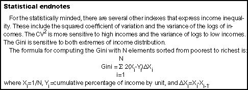
This technique is simple and revealing, but not without awkwardness:
which comparison to choose? Economists have devised several ways
of making such comparisons with a single index number. The most
popular of these is the Gini index (or coefficient or ratio or
number). While it simplifies com parisons, however, the Gini is
not easy to explain. Here's an attempt to do so.
We can start with the nearby graph, derived from the numbers
in the table. The horizontal axis shows the quintiles; the vertical,
the cumulative share of income earned by the plotted quintile
and the ones below it. For example, for 1968, the cumulative value
for quintile 1 is the share earned by quintile 1, or 4.2%; that
for quintile 2, 11.1%+4.2%, or 15.3%; and so on, up to quintile
5, when the sum is 100%. The graph plots these values for 1968
and 1992. These lines are called Lorenz curves. 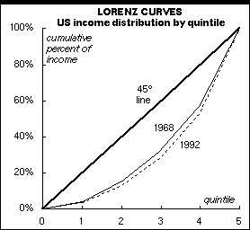
In a society with perfectly equal income distribution, the cumulative
share of income would be equal to the cumulative population share:
e.g., the value for quintile 2 would be 40% (20%+20%), instead
of 1968's actual 15.3%. This mythical egalitarian society is represented
by the heavy 45° line.
The gap between the actual lines and the mythical line is a function
of the degree of inequality; the 1992 line is further away from
the heavy line than 1968's is. The Gini index measures the gap
between the actual line and the 45° line. In the egalitarian
society, the Gini would be 0.000, since the Lorenz curve would
match the 45° line perfectly; the higher the Gini, then, the
greater the distance, and the more unequal the distribution of
income. In a perfectly unequal society, in which one person (or
household or family) had all the income, the Lorenz curve would
look like a backwards "L," and its value would be 1.000.
In practice, the Gini usually falls between 0.200 and 0.450.
This simple Lorenz chart is made only using quintile figures,
so a Gini computed from it would be inexact. For the U.S., real
Ginis are computed using a sample of some 60,000 households polled
by the Census Bureau every March as part of its Current Population
Survey. The Gini formula is pro vided for connoisseurs at the
end of this screed.
Shown nearby are the Gini indexes for families and households,
as reported by the U.S. Bureau of the Census, for cash incomes
before taxes. (Cash income means noncash benefits like food stamps
and the value of employer-paid health insurance are excluded.)
For the first two decades after World War II, inequality trended
raggedly downwards. Since the late 1960s, however, inequality
has been increasing with much less ragge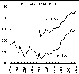 dness
and more thrust than the earlier decline. Note that this polarization
long predates the Reagan years, despite a lot of partisan rhetoric
to the contrary. In fact, the Gini has risen at a fairly constant
rate over the last 25 years no matter which party was in power.
dness
and more thrust than the earlier decline. Note that this polarization
long predates the Reagan years, despite a lot of partisan rhetoric
to the contrary. In fact, the Gini has risen at a fairly constant
rate over the last 25 years no matter which party was in power.
Though the increase in the Gini between 1991 and 1992 has brought
the index to its highest level on record, the change, the Census
Bureau tell us, is not statistically significant, meaning that
it is within the sample's margin of error.
Two Ginis are shown, one for families and the other for households.
Household is a broad concept that includes single people living
alone and unrelated individuals living together. (Unrelated, that
is, by legal definitions; millions of cohabitants consider themselves
families, even if the law doesn't agree.) The average income of
the nation's 68.1 million families is higher, and their income
distribu tion more equal, than the 28.2 million nonfamily households,
since nonfamily households include a lot of poorer people who
live alone. Unfortunately, the Census Bureau only began reporting
income data for households in 1967, so longer-term comparisons
must use the family figures.
U.S. Bureau of the Census. Current Population Reports, Series P60-184, Money Income of Households, Families, and Persons in the United States, 1992 (September 1993).
Joseph E. Stiglitz. Economics (New York: W.W. Norton & Co., 1993).
Hawyard Alker Jr. Mathematics and Politics (New York: Macmillan Company, 1965), as cited in a 1989 computer program by Tom Finholt, Department of Social and Decision Sciences, Carnegie Mellon University.
Markus Jantti. "Changing Inequality in Five Countries," Luxembourg Income Study Working Paper #91 (February 1993).
![]()
Home Mail Articles Stats/current Supplements Subscriptions Links